
North American Kansas Logo
NOTE TO COLLECTORS - This page addresses the logo used at the Kansas City plant and how it compares to logos used at other North American Aviation plants in operation at the time. It does NOT currently address any patches that may have been issued to individual departments or logos that fall outside the time of when the Kansas City plant was open. I am currently working on an update to address some of the other patches and some of the confusion I have seen over the logos. This note will not be on the updated page.Thank you for your patience.
While working with the NAA-K B-25 Bomber Builders Newsletter, I was asked to develop a new logo for the organization. This logo would identify the Bomber Builders from Fairfax. I learned from discussion that the North American Kansas logo was different from the North American Corporate logo. I was shown pictures, patches, pins, and employee newsletters from Fairfax. I have been unable to determine the reason the Kansas plant did not use the existing North American logo. Not only did it have a different logo, it had several.
Today, we live in a branded society. Corporations strictly control logo use and design. It is not uncommon to see rules about size, placement, color, or other possible variables. I have yet to find a document listing the specifications for any North American logo. Back in the early 1900's, corporations thought a little differently. Americans wanted their individuality, but at the same time wanted to be a part of something bigger. I believe this way of thinking lead the Kansas plant to develop different logos.
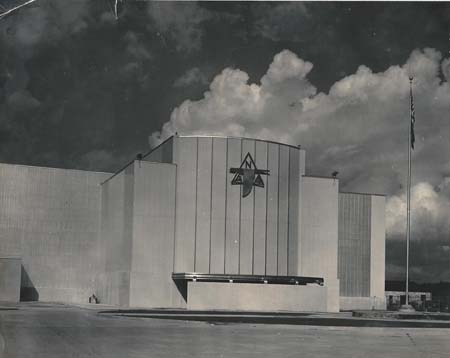
There are some striking differences between the California and Kansas logos. If you look carefully at this early image of the Fairfax plant from late 1941, you will notice the eagle logo faces left, not right. The logo used by the California plant faces right. You will also notice that on the Kansas logos, there is a typically a sunflower with a "K" on the wing. I am uncertain when this addition was made, but I suspect it was early in the plant history.
I have learned a few things about the North American Kansas Logos. When printed, the logo was usually dark on a light background. I have seen it printed in both black and red. When used on a patch or a pin, the logo was usually yellow or gold on a dark background. I have seen this background either red, blue, or black. I suspect the color may have had a meaning. This makes sense as pins were usually made of enameled brass. The patches would have been modeled after the pins. In print, it was much cheaper to simply print the logo on a white page. I have also learned that the "bird" on the North American logo started as a duck. At some point, in the Kansas plant, the duck became an eagle.
Recreating the logos
Recreating the North American, Kansas plant logos is a time consuming process. I select the best reproduced example of the logo I can find. Then, I capture it with the best quality scan I can get. This scanned image is then brought into Photoshop, where the process of creating a digital "trace" begins. There is some art to this as the printing process back in the day was not as accurate or clean as today. Working in a layer on top of the original image, I constantly compare the two to ensure the new logo is created accurately. Once a clean image is created, I import the image into my vector graphic program and start the process of tracing the image again. The "official" logo was a special challenge because the teardrop shapes in the sunflower were never reproduced cleanly. I ended up enlarging the best image I could get and hand drawing the sunflower using a template I created from the best teardrop shape. I then used that image to create the sunflower section of the logo. When complete, I have a print ready, scalable logo.
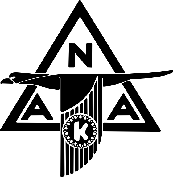
The "Official" Logo
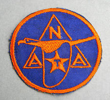
Here is what I am calling the official Kansas Plant logo. I have come to this conclusion due to many factors. I can date this logo in use as early as 1942. It was also in use as late as early 1945. Over the years, I have viewed literally hundreds of documents from the Fairfax plant. This is the logo that I have seen most often. From classified document folders, to documents provided to workers, this logo is everywhere. It would also appear that this logo was used for the design of the patches worn at the plant (seen here). This logo also uses the "duck" shape common to it's Inglewood plant logo ancestor. If you have a D or J model B-25, this is your logo. There is a variant of this logo (seen here). This logo is almost identical to the "official" logo except for the slanted "N". This logo is seen occasionally.
Other Kansas Plant logos
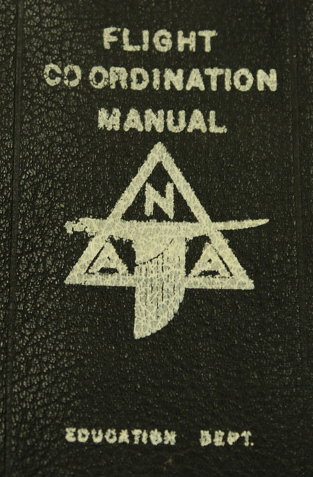
This logo was likely the one that started it all. Basically, it is the North American logo facing left. I have seen this logo used in 1941. This is also the basic logo that appears on the building. Occasionally, I have spotted this logo around in pictures and books. Here it is on a Flight Coordination Manual. It would appear that this logo was used when the Kansas plant printed something for use. Interestingly enough, during 1941, I have seen both the left facing and the right facing logo in use. The right facing logo use faded over time and was limited to items published by North American corporate. One logo used at the Texas plant also had a "T" inside a star on the wing (as seen here). Although I have not studied the logos at the Texas plant in as much detail as the Kansas plant, I suspect the reason the sunflower and the star were added to the logos was to distinguish the Kansas plant logo from the Texas plant logo. This remains unconfirmed.
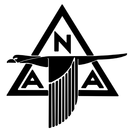
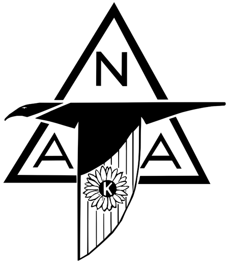
Here is my first North American, Kansas plant logo recreation. I brought this plant logo back to life in 1996. It was used initially on the B-25 vertical tail and rudder assembly. In addition, my logo has also appeared in George Bauer's second book "A Century of Kansas City Aviation History". I also used that logo extensively with the Bomber Builders Newsletter. The image I was given to create that logo was pretty poor. I have since updated it using a better copy of the logo. As it turns out, this logo was used later in the plant history. I am unable to give a specific date to the document it came from. As best as I can tell, this logo dates to around the start of B-25J production. This would place it in late 1943 or 1944. Notice that this logo uses more of an "eagle" shape. The sunflower is also more realistic than the "official" logo. This is my favorite logo. It was also the logo preferred by the bomber builders. The North American Retirees group was called the Bald Eagles likely due to this logo. Because of this, I used this logo when creating the logo for the B-25 History project.
The North American, Kansas plant was only operating for about 4 years. B-25 production spanned less than that. You would think that 4 logos would be plenty. Apparently, you would be wrong. There are more logos associated with the Kansas plant. Rest assured, I am diligently working on those as well. I will update this page when those logos are ready.